Glanceable
- Year
- 2026
- Services
- Stack
- Website
- www.glanceable.io
/CONTEXT
Glanceable is a French SaaS platform that uses proprietary AI to analyze Voice of the Customer data at scale. Their clients include Fnac Darty, Allianz, Orange and Fortuneo. They came to me with a solid brand strategy document but no visual identity to match their ambition: positioning as the European VoC expert against Medallia and Qualtrics.
The existing branding felt generic and didn't reflect the company's expertise or the sophistication of the product. With a new website build planned and an agency selected for development, they needed a complete visual identity system before anything else could move forward.
/PROBLEM
Glanceable had outgrown its visual identity. The old branding used a standard navy and teal palette that blended in with every other B2B SaaS on the market. There was no design system, no art direction, no photography guidelines, and no way to visually differentiate from competitors like Medallia or Qualtrics. The challenge was to build a brand that could speak to enterprise decision makers in banking, insurance and retail while still feeling like a fast-moving, founder-led tech company.
/WHAT_I_DID
I led the full brand exploration from moodboard to final delivery, and designed the website that brings it to life. I started by presenting three distinct creative directions: Precision Lens (light, prismatic, clarity), Trusted Intelligence (neutral, authoritative, warm) and Data Clarity (bold, expressive, connected). After a workshop with the founding team, the client chose a fusion of Precision Lens and Data Clarity.
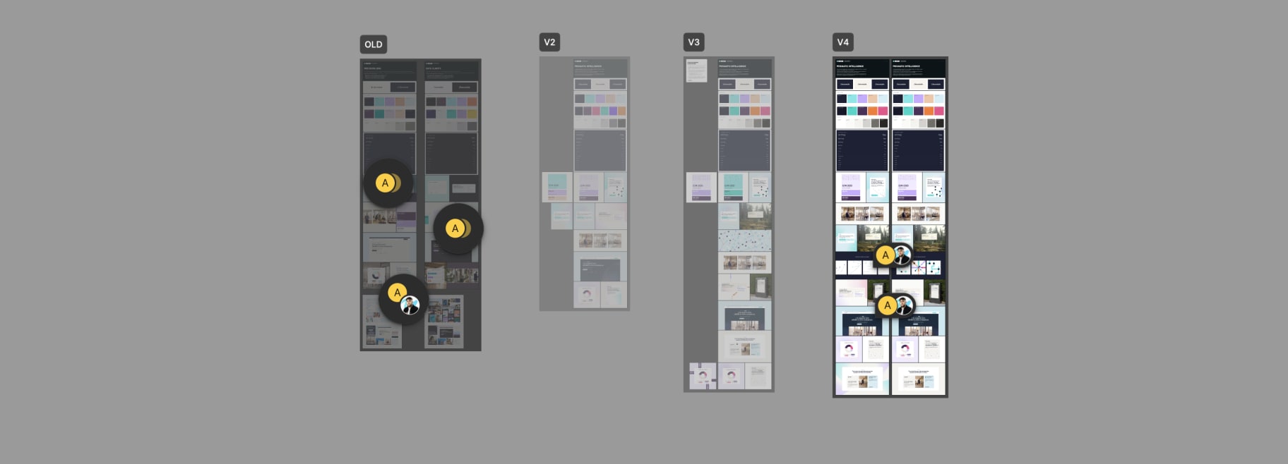
From there I developed the complete identity system: a scaled color palette with primary, secondary and gradient layers, a typographic hierarchy, a photography direction built around prismatic light refractions on glass, a "Connected Insights" pattern system using dots and curves, prismatic gradient textures for light and dark surfaces, product visual mockups, fake ad campaigns, case study templates, and a full brand guidelines deck. I then designed the full website, from homepage to sector pages, blog hub, case studies, demo page and webinar listings, translating the brand system into a cohesive digital experience.
/WORK
/RESULTS
Delivered a complete brand identity system and a fully designed website ready for development. The system includes a full color palette scaled from 50 to 900 across 9 families, a typography system with primary and fallback typefaces, a photography direction with reusable AI prompts, a modular pattern library, product visual templates, ad mockups, and a 30+ page brand guidelines document covering logo usage, color rules, tone of voice, art direction and applications. The website covers all key pages: homepage, platform, sector verticals, case studies, blog, webinar hub, demo booking and resource center.
/WHAT_I_LEARNED
This project reinforced that brand identity for B2B enterprise is a balance between two forces. The client wanted to feel bold and startup-like, but their buyers are VP-level executives at Allianz and BNP Paribas. The solution was never to pick one side but to build a system with two registers: soft and harmonious for everyday surfaces, expressive and saturated for brand moments. The prismatic concept gave us a metaphor that held both together naturally.
I also learned the value of producing real content alongside the visual system. Writing actual ad copy, case study headlines and website sections forced every design decision to prove itself in context, not just on a mood board.