GetMint
- Year
- 2026
- Services
- Stack
- Website
- www.getmint.ai
- In collaboration with
- LA RAMPE
/CONTEXT
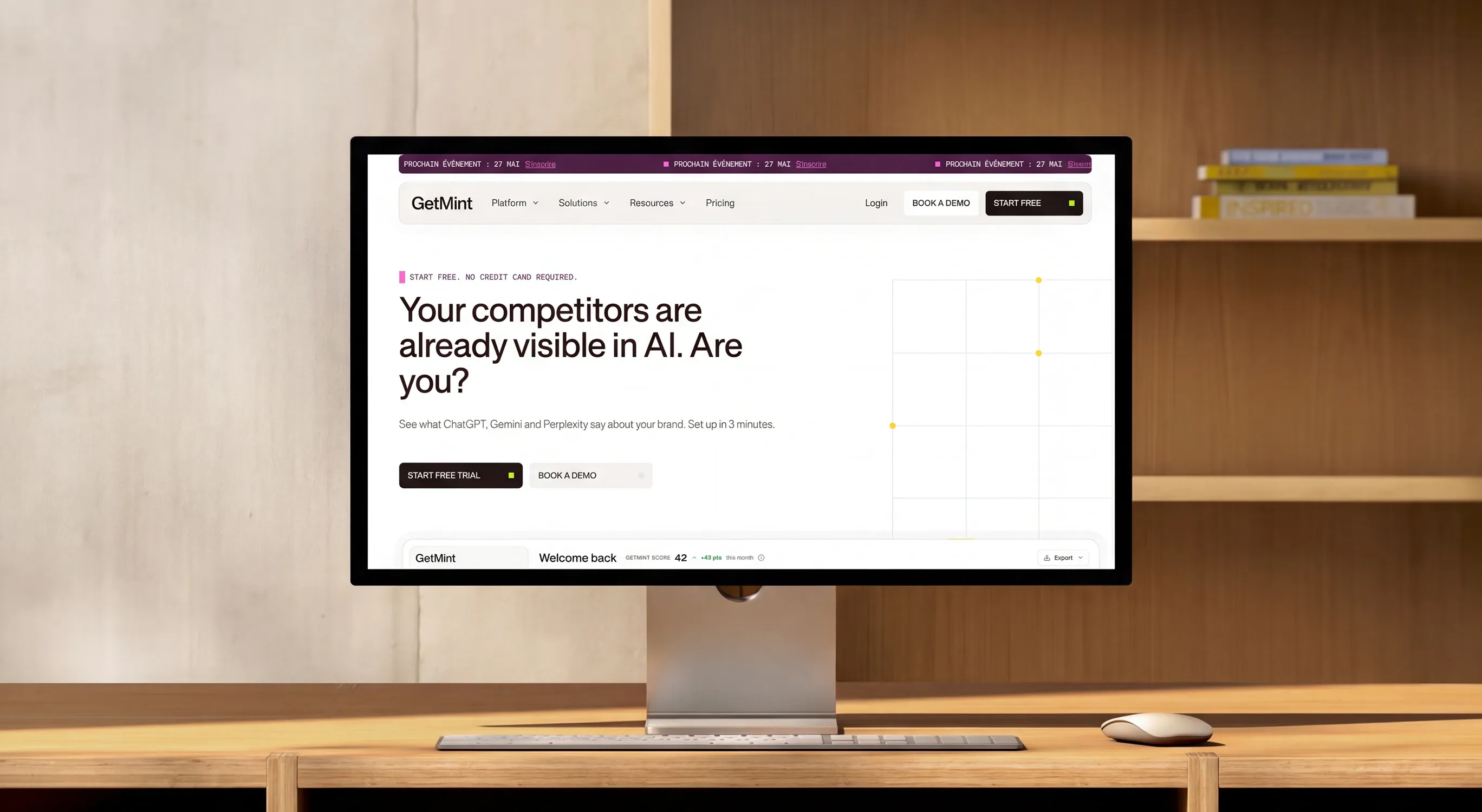
GetMint is a Paris-based SaaS that measures and improves how brands show up in AI answers: ChatGPT, Gemini, Perplexity, AI Overviews. After a €4M round and 200+ clients like L'Oréal, Accor and Lacoste, the team needed a brand and a website that matched a big ambition: become the reference of a brand-new category, Generative Engine Optimization (GEO).
I worked on the rebrand and the new website with LA RAMPE, alongside the creative director.
/PROBLEM
GetMint had two goals that seem to pull in opposite directions. Be playful and memorable, to stand out from cold, corporate competitors. And be credible enough for a CMO at a large company to trust them with their brand.
The first explorations drifted into a retro, editorial look that felt more "70s" than tech. And the category is so new that most buyers don't know what GEO is yet. The website had to explain a new behavior, prove it with data and push a self-serve signup, without sounding like one more SEO tool.
/WHAT_I_DID
With the creative director, I helped shape the brand around one simple rule: the mascot is the soul, the graphic system is the suit. The pixel mascot lives in the product, on social and at events. The abstract, editorial system carries the website and sales material. I explored logo territories, from the asterisk as a citation mark to minimal pixel signs derived from the mascot.
Then I built the Figma foundation: a 50 to 950 color scale, semantic tokens in light and dark, sizing and typography in desktop and mobile, and a documented style guide. On the web side, I designed the home page section by section, and created the product visuals: simplified, stacked UI cards that explain each step (connect, get your plan, publish) in a few seconds.
/WORK
/RESULTS
The client validated the palette, the type pairing and the web direction, and the new home page is now live on getmint.ai with the positioning and messaging we built ("AI is already recommending brands. Just not yours.").
The team now has a design system they can scale into product and marketing without rebuilding components each time. And the product visuals replaced abstract illustrations with real, readable UI, so visitors understand the value before they even sign up.
/WHAT_I_LEARNED
Feedback is material, not a verdict. The V1 was called "too 70s", and the client's screen-by-screen notes made the V2 much sharper. A brand can hold two personalities, as long as each one has its own territory.
I also learned that in B2B SaaS, a simplified piece of real interface sells better than any illustration. And setting up tokens early, with Claude and the Figma MCP in my workflow, let me move fast on the website without breaking consistency. That's the kind of designer I want to be: one who designs and builds.