Bravi
- Year
- 2026
- Services
- Stack
- Website
- www.bravi.app
- In collaboration with
- KLIMB
/CONTEXT
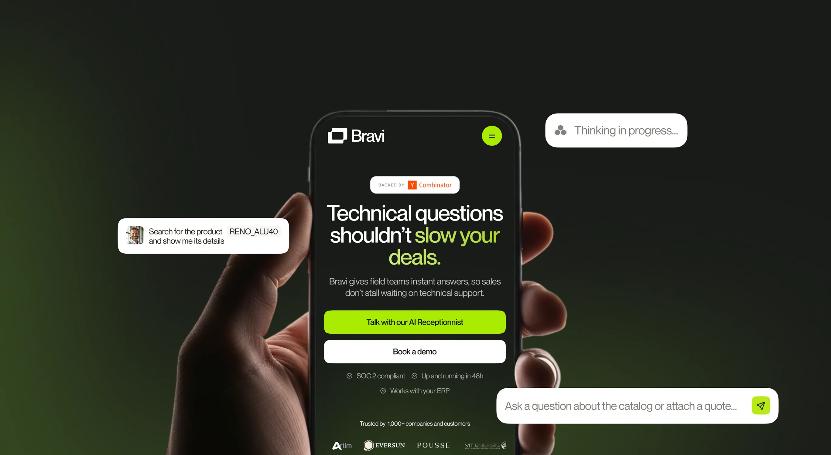
Bravi gives manufacturers' field teams a technical expert in their pocket. Reps ask a question on their phone, and Bravi answers using the company's catalogues, pricing and ERP data, so deals don't stall waiting for tech support.
The team had just raised funds with Y Combinator and needed a brand to announce it, and to show the market they were a real company, not a side project.
/PROBLEM
Bravi sells to established manufacturers and installers, with C-level buyers and users who are often in their fifties. The brand had to feel like a "big company": clean, credible, reassuring. But it also had to stand out in a sea of AI startups that all look the same.
The brief came with clear no-gos: nothing that looks early-stage or SMB, no cold black and white AI look, nothing too colorful or B2C, and no illustration-only universe. The product had to stay front and center.
/WHAT_I_DID
Logo and identity. We built a logo and a full brand system that sits right in the middle: serious but friendly, refined but energetic, a little rebellious but humble in tone. Recognizable enough that you know it's Bravi at first glance on LinkedIn.
Landing page. I designed a landing page built around the product, with clear demos and workflows that show a rep asking a question and getting a complete answer, instead of abstract promises.
Product visuals. I created product visuals mixing real UI with field photography, to anchor the AI in the real world: job sites, installers, sales conversations.
Launch assets. I produced the full kit for the fundraising announcement: LinkedIn posts, social assets and email signatures, so the whole team could show up consistently on launch day.
/WORK
/RESULTS
Bravi launched its funding announcement with a brand that looks ready for the manufacturers it sells to. The identity now runs across the website, the product and the team's everyday communication.
/WHAT_I_LEARNED
The hardest part of a brand is often what it must not be. Here, the list of no-gos was as useful as the list of goals: it pushed us toward a middle ground that feels credible for industry without losing personality.