AdsClimb
- Year
- 2026
- Services
- Stack
- Website
- www.ads-climb.fr
- In collaboration with
- Visuweb
/CONTEXT
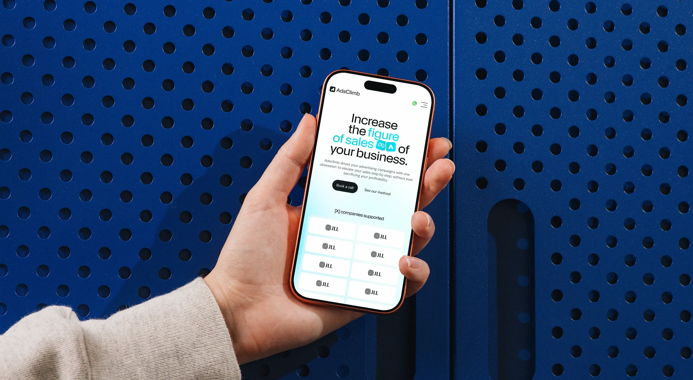
AdsClimb is a young media buying agency with one focus: bringing new clients to businesses through Meta Ads and Google Ads. The founder had a clear offer, three pricing plans and a name, but no visual identity and no website. I worked on the project in collaboration with Studio Visuweb, from the first brief to the final website design.
/PROBLEM
Most ad agencies look the same: dark gradients, rockets and big promises. And AdsClimb's prospects arrive with strong doubts. "It's too expensive." "I already tried ads and it didn't work." "I'm scared to lose my budget." The brand needed to stand out in a crowded market, and the website had to answer those doubts before anyone even picks up the phone.
/WHAT_I_DID
Brand first. With Visuweb, we explored two directions, one warm and orange, one more colourful and illustrative. The client finally fell for a cleaner, more tech reference, so we pivoted to electric cyan, deep ink and a lot of white. The symbol plays with the name and the idea of an ascent, KMR Apparat gives the titles their sharp character, and the tone of voice stays short and direct.
Then the website. Every section answers an objection: transparent pricing for "too expensive", case studies and testimonials for "it didn't work", and product visuals that show real campaigns and reporting, so the job feels concrete. WhatsApp stays one click away on every page, because fast and personal contact is the agency's real promise.
/WORK
/RESULTS
AdsClimb now has a brand that doesn't look like every other ads agency, and a website built to turn visitors into conversations. The tagline sums up the whole identity: "The slope is steep. We handle it." Same voice, same visuals, from the homepage to the ads the agency runs for itself.
/WHAT_I_LEARNED
Showing directions early is never lost time, even when the client changes his mind. The first two explorations helped him understand what he didn't want, and the final brand came out stronger for it. I also learned to design a website around objections rather than features: when every section answers a doubt, the page sells by itself. And working with Visuweb reminded me how much a clear brief saves later.